

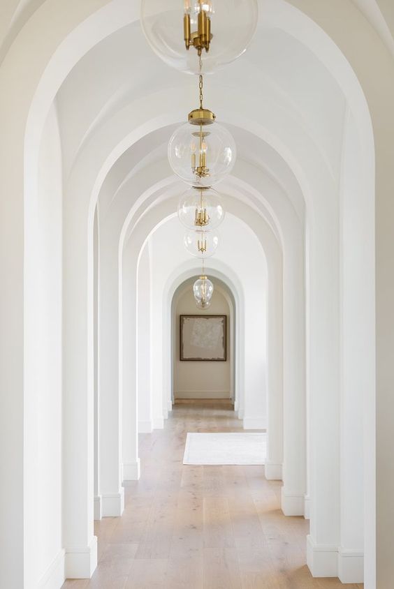
How To Choose The Best White Paint
If I was to say there was just one colour you could choose that would be an instant freshness booster, a calm creator, warm and welcoming one moment, lively and uplifting the next, you’d perhaps think I’d lost my mind.
But it’s true friends, and the magical colour? White.
Anyone that has tired to find themselves the best white paint in recent years will have realised there’s a little more to white that meets the eye. But it’s doesn’t need to be complicated.

Today, there are hundreds of shades of white paint available, but the crucial component to understanding the undertone, the rooms lighting and what mood you’d like to create.
Depending on the lighting in your home (both natural and artificial) and other colours in your room, your white wall well, it may not even look like white at all. #OpticaIillusion
Here’s the #WhiteIsNeverReallyWhite lowdown and how you can select the perfect choice for your home.

IT’S NOT NECESSARY TO USE THE SAME WHITE PAINT THROUGHOUT YOUR HOME.
A white paint colour will look different in each room of your home because the lighting in the room will have an effect on the colour.
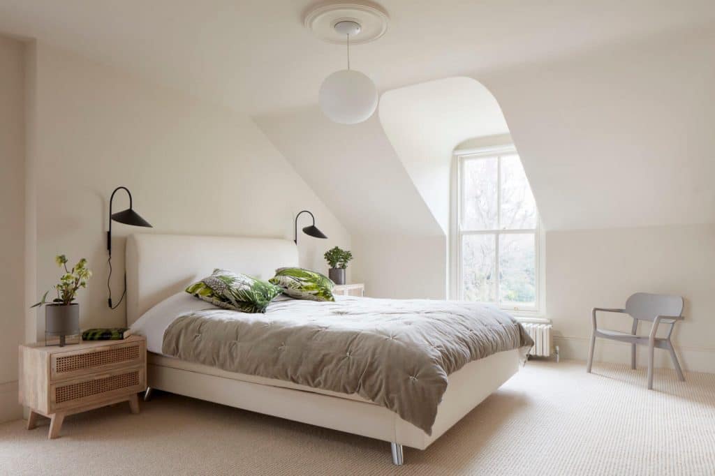
You can choose warm white paint or cool white paint, depending on the mood you wish to create. For example, if you want the bedroom to have a cosier, warm and relaxed look and feel, you could choose a softer, warmer white. If you want your kitchen to be bright and lively, choose a brighter white with cool undertones.

WHITE PICKS UP OTHER COLOURS IN YOUR ROOM.
White paint is never pure white at all, it’s a very light version of other colours. That’s why sometimes you may look at white on your wall and feel as if it has a hint of another colour.
White is the palest shade of a colour, so a hint of the undertone often shows through. When you choose white to match the colours in your room, the undertone will be even more noticeable.
When you choose a white with the undertone colour in mind, you can create a beautiful, cohesive space.
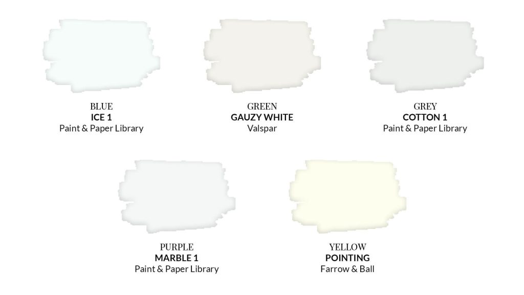
How can you know what the undertone of a white is on a paint swatch? Look at the deepest colour at one end of the swatch. The darkest shade will often reveal the undertone. Some whites have a purple, yellow, blue or grey undertone.
Take A Look At These Examples:
Blue undertone – Ice 1 – Paint & Paper Library
Green undertone – Gauzy White – Valspar
Grey undertone – Cotton 1 – Paint & Paper Library
Purple undertone – Marble 1 – Paint & Paper Library
Yellow undertone – Pointing No.2003 – Farrow & Ball
LIGHTING IN YOUR ROOM
Colours are affected by light, so it’s important to choose your white paint colour based on the room you are painting. You’ll see that white paint will look quite different from one room to another as it will change due to the light in the room, the direction the window faces as well as the time of day.
Does your room face north, south, east or west? This will affect the way the light enters and is reflected in the room.
North:
Okay, so you’ve got a dark room; you just need more light or white, right? It’s easy to think that white is a good idea when decorating a north-facing room; light means bright, right?
Well, it does, but add in cooler light, with a lack of crisp shadows, and you may feel white is a little lacklustre and gloomy. As the light is more diffused and less direct, softer, warmer shades can make the most of the lighting conditions.
If you want to try white, make your space feel as bright and airy as possible. Choose a white paint colour with a warm undertone, avoiding any whites with cool undertones. Click here to learn How To Decorate A North Facing Room.
Warm White Paints We Love:
White Tie No.2002 – Farrow & Ball

South:
Southern exposure rooms have the most intense light and have a natural warm hue with the direct light coming in.
A room with southern exposure and lots of direct light will have a warm hue and will enhance white paint that has warm undertones such as yellow, red or orange.
If you want to counteract that warmth, choose a cool white paint that has a blue/grey undertone. Cool white paints with a blue undertone will absorb the red in warm natural light.
Cool White Paints We Love:
Strong White No.2001 – Farrow & Ball
Loft White 222 – Little Greene
Welcome Pale 179 – Little Greene


East:
East-facing rooms are warm in the morning and cool in the late afternoon.
West:
West-facing rooms are the opposite with cool light in the morning and warmer light in the afternoon.
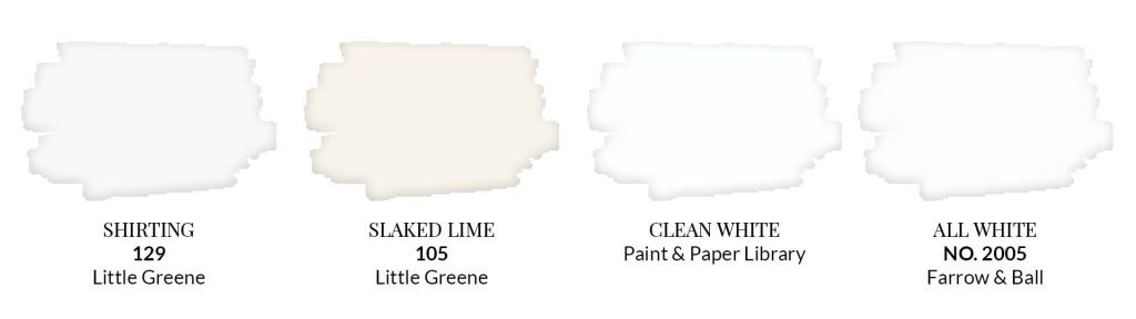
As East and West facing rooms have both cool and warm light shining in, you will notice that your room may look different at various times of the day. If you want a Neutral White paint colour, here are a few suggestions for paint that will enhance both cool and warm colours.
Neutral White Paints We Love:
Clean White – Paint & Paper Library


These are just a few suggestions on choosing white paint. I hope it helps take a bit of the guesswork out of selecting the best white paint colours for your home.
If you found this a bit too overwhelming, stick with the Neutral Whites we mentioned. I adore the Little Greene white paints, some of the favourites that I recommend time and time again are Little Greene Shirting + Little Greene loft white, my go to whites.
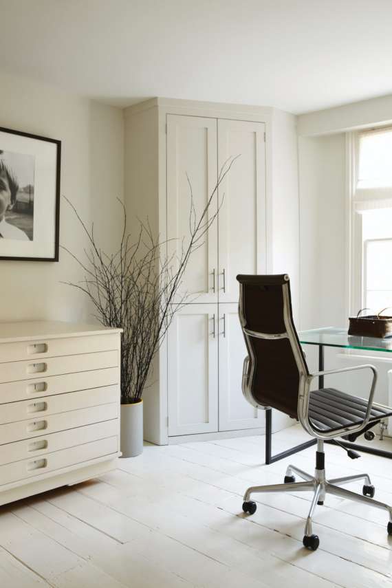
I’ve paired Little Greene Shirting with Farrow and Ball Cornforth White in my home office (it was a tough call between farrow and ball Ammonite or Cornforth white), get three ways to use Cornforth White in your home here.
Looking for some more lovely colour combinations? Here are 7 living room colour palette ideas.
If you’re looking to understand more about the brands and are designer paints really worth it? Take a look at the Little Greene Paint Company The Ultimate Guide + Farrow and Ball Paint Colours The Ultimate Guide.
If you’re ready to take your decorating skills up a notch….. Grab the Ultimate Home Design Toolkit below!

Create a room you love… without the overwhelm, confusion or costly mistakes
Say goodbye to half-finished rooms and design guesswork. The Starter Kit walks you through the essentials… vision, colour, mood boards, and styling… so you can transform your space without wasting time or money.
No more ‘hope it works’ decorating… this is your blueprint for a beautiful room.