Understanding Colour When Decorating
Recently we looked at how creating a moodboard can help save time, money and stress when it comes to decorating, so we thought we carry on these helpful snippets of advice and explain a little about how colour works in the home.
Before you even start a decorating project, colour is probably the first thing on your mind. We usually have some idea whether we want the room to have a splash of colour, look muted or remain plain white, but that decision is often based around our personal preference and whether something “looks right”.
But the thing to remember is, on a technical scale, certain colours work together, and some – well, don’t. In this post we’re going to talk about the different ways colour schemes work and how to incorporate them into your own interior design projects.

As you know, there are three primary colours in the colour wheel – red, yellow and blue. When these are mixed together, we can create secondary colours – green, orange and purple. Tertiary colours, meanwhile, are when primary and secondary colours are mixed together in equal parts.
When we create a colour scheme, we’re looking for shades that, when placed next to each other in a room, look amazing. Here are four different examples to help you when it comes to understanding colour in the home.
Analogous
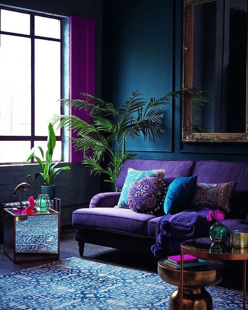
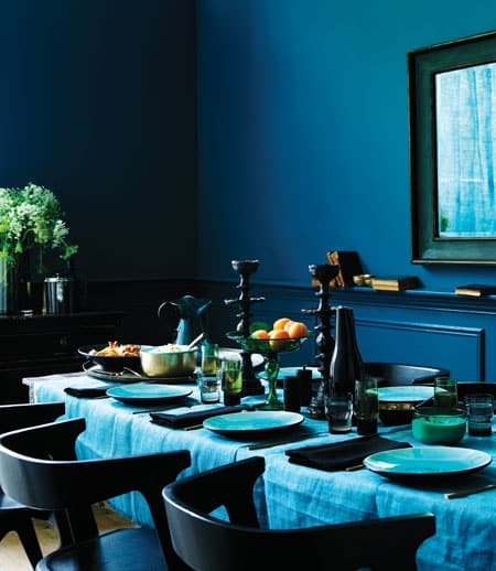
A favourite with designers right now, an Analogous colour scheme includes three hues, which all sit next to each other in the colour wheel.
There is usually one dominating colour, for example, blue, which takes up 60% of the space, such as on walls, rugs or larger pieces of furniture.
Meanwhile, 30% will then be your accent colour, so blue-green, for soft furnishings, bedding etc.
And finally, the last 10%, purple for example, proves itself a great supporting colour used for cushions, decorative accessories and artwork. This is a super calming way of using more than two colours in the home.

Complementary
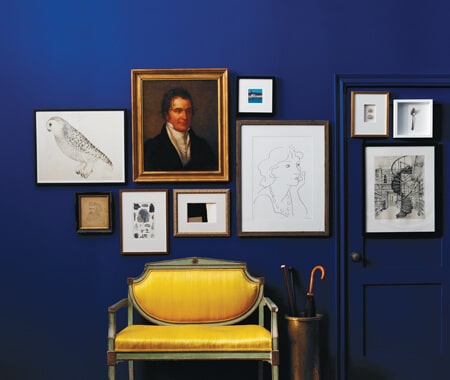
A complementary colour scheme is created by using two colours that sit opposite each or in the colour wheel, such as blue and orange or yellow and purple.
This colour pairing is definitely for the braver decorator, but when done properly can have an amazing impact.
Don’t listen to the advice of red and green should never be seen because in interiors, it can look create an instant wow factor.

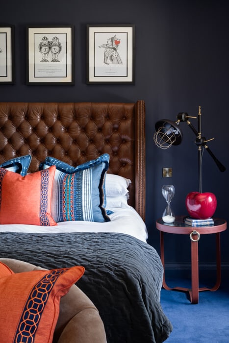
Split Complementary
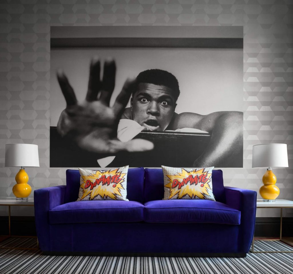
A slightly less dramatic option than a complementary colour scheme, split complementary is where you take one main colour and then choose two other shades that sit either side of what would have been its complementary colour.
For example, if you have red, and the complementary shade is green, then a split complementary would utilise greeney-yellow and bluey-green. Although this could still be a statement colour combination, it’s definitely a more balanced approach to using bolder shades.
Triadic
A triadic color scheme features three colors evenly spaced throughout the colour wheel.
There are ways, however, to create a subtle muted triadic scheme, choosing lighter shades such as soft powder blue, light yellow and splashes of red.
Or perhaps you could choose a more British Coastal inspired design, with blue as your main colour, with yellow as the secondary colour and just hints of red throughout.
Plum, burnt orange and sage green is a colour combination that works incredibly well, especially for a more bohemian-inspired room, such as the living room or bedroom.


Monochromatic
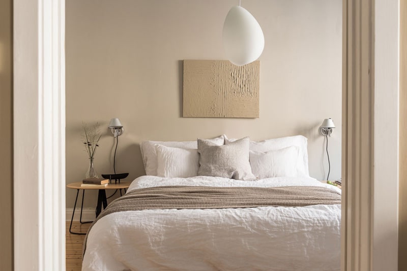
We can’t talk about understanding colour without mentioning monochromatic. The final colour scheme is one of our favourites – simple but effective.
A monochromatic scheme uses one base colour and then all the different variations of that as accent shades. This is a really harmonious way of decorating and one that can either make a room look much brighter, or even cosier if darker shades are utilised.
Another example of a monochromatic colour scheme is to have your signature black and white colour pairing, which can look striking when done correctly.
We hope these examples have given you some food for thought when it comes to understanding colour and schemes, in terms of what works technically. However, you know our thought process here at NatalieGisborne.com – rules are there to be broken, especially when it comes to interior design and your own personal taste.
And if you’re looking for a little more guidance when it comes to creating your dream home, why not join HomeEnvy Bootcamp – a one-stop shop for all things interior design, including masterclasses on creating your dream space, 20% trade discounts, access to professional interior designers, weekly design packs, and a private community of like-minded individuals.
Natalie xx

