

Cornforth White Farrow and Ball
So have I found you THE unicorn in Cornforth White by Farrow & Ball? Could I have possibly found the perfect grey? Dramatic, I know. If you’re looking for an understated, easy to live with and super relaxed grey, Cornforth White Farrow Ball should be a contender.
You’ll know by reading this post all about the hunt for the perfect grey; grey is a tricky colour to master….Perfect is, therefore, likely an impossibility!
However, as Cornforth White is one of Farrow and Ball’s most popular colours, I thought this understated star was worth a closer look.
What colour is Cornforth White?
Cornforth White is a super versatile grey that’s neither too warm nor too cool. It’s easy to live with, and I should know as I do, during office hours at least. As I write this post, it’s the colour that cocoons me in my office, and I adore it.
Here’s a little look at some Cornforth White inspiration.


Cornforth White An Understated Grey
So today, I wanted to inspire you with a little Cornforth White colour schemes and inspiration and a few sophisticated palettes you can recreate in your home. Let’s get started.


Farrow and Ball Cornforth White // Palette One
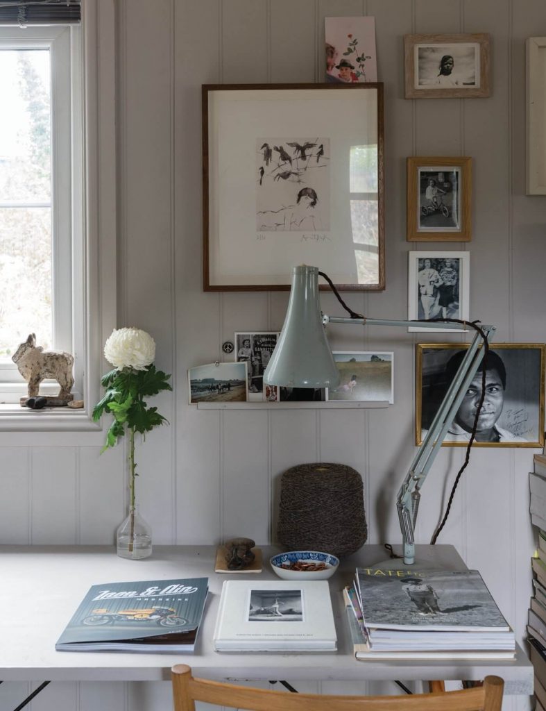
The inspiration for my home office came from a gorgeous painting by Quintessa Art (one for you’re little black book if you’re looking for colour-matched artwork). I was super lucky to win it at the first interiors trade show I ever attended in 2011. I took it as a sign that my career change in the world of interiors was a good thing.

It’s followed me around various homes and offices but never had a place where it looked at home. It’s always seemed like it was given to me to be the basis for my home office design at some point. And eventually, that happened (we’ve been renovating our Edwardian home since 2011, it’s lived in 7 different places)
TIP: An inspiration item can be one of the very best ways to start the creative juices flowing. If you need other places to get interior design inspiration, click here.
Here’s a little look at the gorgeous abstract combination of white, grey, blue, black and gold.

Cornforth White Home Office
I’m much more of a fan of low-contrast colour combinations. I need my space to make me feel calm and relaxed. For me, that means muted colour combinations, light and airy, especially in my office where I want to feel calm, relaxed and by doing so creative, energised and productive.
With a beautiful wooden oak plank flooring from Silvan Floors, I needed a grey with a little warmth, nothing too cold, to tie in the other elements and to also create the look and feel I wanted in this space which was creativity fueling, energising, relaxing, productivity inducing, elegant and stylish.
If you’re wondering what shade is lighter than Cornforth White? take a look at Ammonite. I’d contemplated ammonite farrow and ball but wanted a little more depth. And if you’re on the white hunt, and wondering what is Farrow and Ball’s most popular white, check out All White, the white with no other pigment,
I love traditional features such as oak flooring and gorgeous period cornice and had built a beautiful custom flatpack (check out jali) floor-to-ceiling bookcase. Still, I also wanted a fresh, sophisticated modern feeling.
And Cornforth White Estate Emulsion by Farrow and Ball delivered an understated, extremely versatile, easy neutral paint colour.
Fabrics // Beauchamp Velvet Fabric by James Hare | Kasuri Fabric by James Hare | Shagreen Silk Fabric by James Hare
Paint // Cornforth White 228 by Farrow + Band and Ammonite by Farrow + Ball
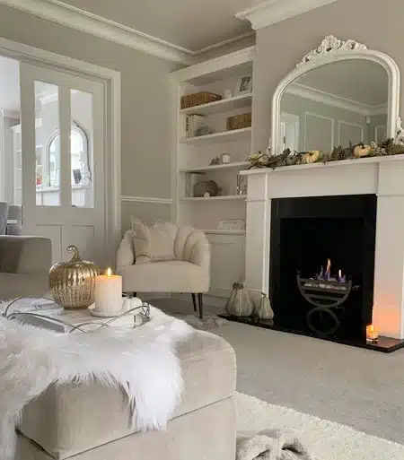
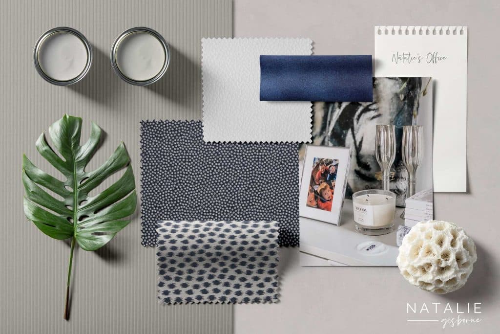
Cornforth White // Palette Two
Recently we’ve covered interior design trends. We’re all looking to get more tranquillity in our homes this year. I decided on a calming and tranquil route with a couple of schemes.
Below is a beautiful soft marriage of Cornforth White by Farrow + Ball, Strong White by Farrow + Ball + All White by Farrow + Ball, keeping the backdrop soothing, soft and simple.
To create some contrast and interest, I’ve added lovely muted blue tones and soft, delicate patterns to bring some elegant serenity.

Fabrics // Clarke & Clarke ALVAR F0753-60 | Harlequin CORALITE HFRA131929 | Harlequin HFRA131914 | Harlequin Fragments Fractal 131921-01
Paint // Cornforth White 228 by Farrow + Ball, All White by Farrow Ball + Strong White by Farrow + Ball

Create a room you love… without the overwhelm, confusion or costly mistakes
Say goodbye to half-finished rooms and design guesswork. The Starter Kit walks you through the essentials… vision, colour, mood boards, and styling… so you can transform your space without wasting time or money.
No more ‘hope it works’ decorating… this is your blueprint for a beautiful room.
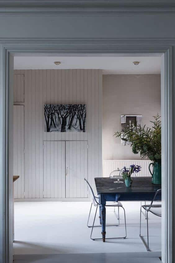
Cornforth White // Palette Three
Paint colours scheme three was inspired by this delicious scene from Desenio. Another design that instantly calms you with natural textures and muted elegant colour choices, soft, serene and simple.
Here we’ve warmed it all up a little and headed to a sophisticated neutral palette of Cornforth White, Purbeck Stone and Moles Breath.

Fabrics // Clarke & Clarke F0453-54 | Clarke & Clarke Linoso F0453-53 | Clarke & Clarke Silhouette F1338-05 | Sirocco F1339-05 | Kirkby Design Dakota Suede Fabric
Paint // Cornforth White 228 Farrow + Ball, Purbeck Stone Farrow + Ball + Mole’s Breath by Farrow + Ball
Another popular combination that you can’t see here is a mixture of Purbeck Stone by Farrow + Ball and Ammonite, combining palettes one and three. This shows that these groups of easy neutrals can be combined in many ways.
Colours That Go With Cornforth White
Soft Neutrals: To create a serene and cohesive space, pair it with soft neutrals like light greys, warm whites, and subtle beiges. Think shades like Farrow & Ball’s Ammonite or Skimming Stone.
Rich Blues: For a striking contrast, rich blues can work wonderfully. Navy blue or a deep teal can add depth and interest to a room while complementing the subtlety of Cornforth White.
Earthy Greens: Earthy, muted greens like sage or olive can bring a natural, calming element to the space. These greens blend harmoniously with the grey tones in Cornforth White.
Dusky Pinks: Soft, dusky pinks or blush tones can create a gentle, warm contrast and add a touch of femininity and warmth.
Burnt Orange or Terracotta: For a bolder look, consider warm tones like burnt orange or terracotta. These colours can add a cosy, inviting feel to a room.
Charcoal Grey: To add drama while maintaining a monochrome palette, a darker grey like charcoal can work wonders. This creates a sophisticated, modern look.
Metallic Accents: Consider using metallics like brass, gold, or copper for accents and fixtures. These can add a touch of luxury and warmth.
Remember, the best colour combination often depends on the room’s natural light, the room’s purpose, and the overall aesthetic you’re aiming for. Always test your colours in the space with samples to see how they interact with the lighting and other elements in the room.
I hope Cornforth White 228 Estate Emulsion is now a solid choice for a sophisticated, totally understated and extremely versatile neutral grey paint colour for your home. I hope the above paint colours have given you a group of easy neutrals to consider that are neither warm nor too cool but can be hard to get right. If you have this or use this paint in your home, I’d love to see so tag me over on Instagram.
If you’re searching for Cornforth White farrow and ball colour match check out this post Is Farrow and Ball paint worth the money?, and you’ll see there isn’t as much of a price difference as you think. Looking for Farrow and Ball cornforth white front door inspo, head on over to Pinterest and look at out front door ideas!
If you’re a farrow and ball Cornforth White fan, be sure to check out some other Farrow and Ball colours that are so popular 8 examples of why farrow and ball railings is so popular!
Chandrika dassanayake
Hi good evening
I googled Cornforth white to see what sort of a colour it is and came across your article.
I am wondering if you are able to offer advice on paint colours for new build homes as a service plse?
Thank u
Chandrika
X
Natalie
Chandrika dassanayakeHey Chandrika,
Thanks for stopping by and having a read, Cornforth white is a great versatile grey.
This is exactly what we offer inside our community to members, have you taken a look at the ultimate Home Design toolkit? You can click here to find out more, would love to help you with paint colour selection, but would be great to see your home https://nataliegisborne.com/the-ultimate-toolkit/
Many thanks
Natalie