

How To Choose Paint Colours // The Ultimate Guide
(Tip + tricks that make it easier)
Let me guess one of your first thoughts when decorating a room? The colour.
Choosing paint colours for a room in your home may seem like a difficult task, but it’s really quite simple when you know where to start.
Here are a few designer tips for how to choose paint colours and help you decide on a colour palette that will bring you joy….. Every time you enter the room lovely!
Let’s get some colour confidence on…
TO START, PICK YOUR COLOURS LAST!
Here’s the biggest tip of all. Don’t pick the colour first.
When I’m creating a scheme the colour will be one of the last elements I select, it’s far easier to select paint colours, fabric and finishes that coordinate and harmonises with the elements in the room, than it is to find a room full of harmony to match your colour choices.
Leave your paint colour selections until you start to develop your scheme, select the big-ticket items first the sofa, the bed, and things that you need to work with, and then select colours.
But if you’re at that stage and looking for some colour inspiration and where to start, here are some ideas to start the creative process.
YOUR FAVOURITE COLOURS
Take a look at your wardrobe. It’s very likely that your favourite clothes are in the same colour family.
What colours are you drawn to? What colour of home décor accessories do you find yourself buying most often….Blue cushions??
Which colours do you associate with the things you love or the places you love to be? Are you drawn to green because you love nature and being outdoors? Perhaps you find aqua and sandy tones soothing because you love the beach.
Choosing colours that you are attracted to will help you to create an environment in which you feel the most comfortable. Make sense?
If you are drawn to bright, vibrant colours like coral and lime, that doesn’t mean you need to paint your walls those colours. You can have a neutral wall colour like grey or cream and add touches of your favourite colours as accents. The beauty of choosing a more neutral wall colour is that you can change things up as often as you like with coloured accessories.
BE INSPIRED BY AN ITEM THAT YOU ABSOLUTELY LOVE
Is there an item such as a throw, handmade quilt or treasured artwork that you know you will be displayed in the room? Use it as inspiration and pull a colour or two from it.
I often use fabric as inspiration for entire schemes, and it’s a great little tip for you if colour combining is a little tricky…. The fabric designer has already put in the legwork to create a colour palette idea that works together, so use it as inspiration.
VISUALISE THE ROOM BEFORE YOU START PAINTING
There are so many paint companies that offer visualisers so you can actually see paint on the walls of your room before you commit (Here’s one from Dulux). It’s a good idea to experiment before you make a colour choice. Usually, all you have to do is take a picture of your space and then try various wall colours until you get the look you love.
You could even try mixing the wall colours so you have one vibrant colour on a focal wall (where a prominent feature like a fireplace might be) and another complementary colour on the other walls.
Whilst we’re all fans of virtual at the moment, if you can grab yourself some tester pots. You need to see how the light will affect the paint in your room. Don’t paint patches on the wall, get yourself some lining paper and paint that, then you can move it round the room and observe it at different times of the day.
CONSIDER THE MOOD YOU WANT IN THE SPACE
Every colour creates a mood and has a specific meaning in various cultures. Let’s look at some basic colour psychology to see how certain colours are perceived in your home:
Red
On one hand, red is associated with love and passion. On the other, it’s associated with spiciness, fire and violence.
Red is also associated with confidence and prestige (think red carpet events). In interior design, red makes a powerful statement. It is said to increase the appetite and keep conversations flowing, which is why red is often used in restaurant décor.
Suitable rooms for red décor: dining rooms and social rooms such as living rooms.
Orange
Orange is a vibrant colour that is energetic and joyful. Just like the fruit, orange is associated with health and vitality. Orange is also associated with creativity and change.
Suitable rooms for orange décor: kitchen, craft room, child’s playroom
Yellow
Yellow is one of the most joyful colours and, like sunshine, has an uplifting effect. If you want a room to feel playful and cheery, add yellow paint or yellow accents.
Suitable rooms for yellow décor: kitchen, bathroom, guest bedroom, nursery
Green
Down-to-earth and soothing, green is the colour of nature and represents new beginnings, change and growth.
There is something very calming about green. In interior design, green can have a balancing effect and create a harmonious space.
Suitable rooms for green décor: office or den, living room, bedroom
Blue
The colour of the sky and water, blue is associated with clarity and tranquility. It has a calming effect on the senses and is also a revitalising colour. Used in interior design, blues can be peaceful, refreshing and inviting.
Suitable rooms for blue décor: office or den, living room, playroom, bedroom, bathroom, child’s room, nursery
Violet (Purple)
Violet is a colour of wealth, prosperity and royalty. It also represents creativity and imagination. In design, dark violet can give a feeling of extravagance.
Violet is a spiritual colour and encourages focus and contemplation.
Suitable rooms for violet décor: office, bedroom, meditation room (light to medium shade), nursery (pastel)
Pink
Although Pink is not listed as a colour on the colour wheel, it is the only tint of a colour (red) that has a colour name. Feminine and pretty are key words to describe this romantic, soothing hue.
Suitable rooms for pink décor: bathroom, nursery, girl’s bedroom
Accent Colours That Are Warm Or Cool Will Also Affect The Mood
You can easily add beautiful colours to your space without overdoing it. Simply use a neutral shade on the walls and accent colours on trim, doors, the ceiling or built-ins. If you’d like some help with white paint click here to understand how to choose the perfect white paint.
If you’d rather use accent colours throughout the room on the furnishings, choose colourful window treatments, pillows, area rugs and accessories.
Neutral paint shades can appear warm or cool, depending on what you pair them with. So if you choose a deep gray wall colour, you can use accessories and soft furnishings in cool shades of blue or green to create a relaxing seaside effect or pair the gray with vibrant orange or yellow for a warmer effect that adds energy to the room.
GORGEOUS COLOUR PALETTES TO INSPIRE YOU:
Colour Palette Idea #1
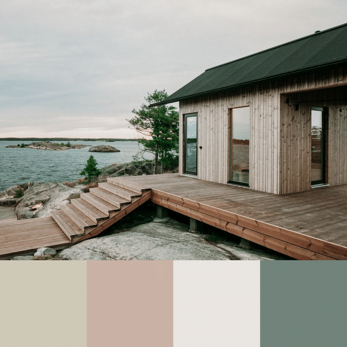
Inspiration for our first palette came quite naturally (literally).
This breathtaking colour palette will create a serene and restful environment, ideal for a bedroom or living room where you want to sink into the sofa after a busy day to unwind.
Organic touches like natural wood flooring and jute carpets enhance a nature-inspired paint palette and give a space a sense of harmony and balance.
Fescue 231 – Little Greene | Light Peachblosson 3 – Little Greene | Welcome -Pale 179 – Little Greene | Livid 263 – Little Greene
Colour Palette Idea #2

A neutral palette doesn’t necessarily mean all white. For this palette, mocha and gray add subtle hints of colour that give this room its quiet sophistication.
Bringing hints of colour into the space with the cutting board, lampshade, picture frame, bowl and rug lends additional elegance to the design.
Mid Lead Colour 114 – Little Greene | Loft White 222 – Little Greene | Mocha 211 – Little Greene | Rubine Ashes 243 – Little Greene
Colour Palette Idea #3

How absolutely mesmerising is this colour combination? We fell head over heels when we saw these muted shades creating such a divine palette.
French country colours always have the most incredible lived in, well loved look and feel. You don’t have to reside in a chateau to use this gorgeous palette in a bedroom, living room or master bath to create a spa-like setting.
Arquerite 250 – Little Greene | Celestial Blue 101 – Little Greene | Dorchester Pink 213 – Little Greene | Down 242 – Little Greene
Colour Palette Idea #4
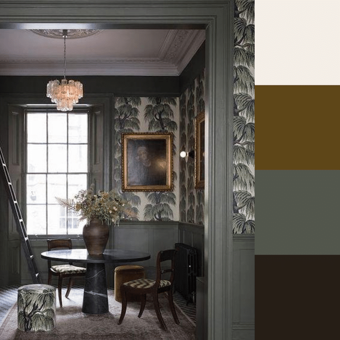
Hollyhock, bronze green and rich chocolate give this palette luxurious depth and beauty.
Mix up patterned wallpaper and bold fabrics to add several layers to a space. A mix of texture and pattern makes a room like the one above, look lived-in yet well put together.
Hollyhock 25 – Little Greene | Light Bronze Green 123 – Little Greene | Pompeian Ash 293 – Little Greene | Chocolate Colour 124 – Little Greene
Want to know more about how to choose paint colours? Read all about how to create a whole home colour palette here.

Create a room you love… without the overwhelm, confusion or costly mistakes
Say goodbye to half-finished rooms and design guesswork. The Starter Kit walks you through the essentials… vision, colour, mood boards, and styling… so you can transform your space without wasting time or money.
No more ‘hope it works’ decorating… this is your blueprint for a beautiful room.