

The simple trick to a home that flows and feels effortlessly pulled together – creating a whole home colour palette!
When it comes to designing a home you actually love being in, colour is one of the most powerful tools you’ve got.
I’m not just talking about the colour you roll onto the walls and hope for the best. I mean the whole palette… the way tones echo and flow from room to room. The energy they bring. The mood they create. How they either wrap you in a big cosy hug or make you feel like you’ve taken a wrong turn into a totally different house.
Getting that flow right? That’s the secret. That’s why creating a whole home colour palette is everything when it comes to nailing that harmony
And if you’ve ever stood in front of a colour chart for so long you lost all grip on reality (is that “Soft Pebble” or “Linen Whisper”? Are they… different??), then lets chat a little more about the whole home Colour Palette….
Because once you’ve got this in place? Game changer.
Here’s some questions we’ll be covering
- How many colours for a whole house palette?
- What is the 60/30/10 rule?
- Should my whole house have the same colour?
- What colour is best for a whole house?

Why bother with a whole home colour palette?
Great question. Here’s why this step matters way more than people think:
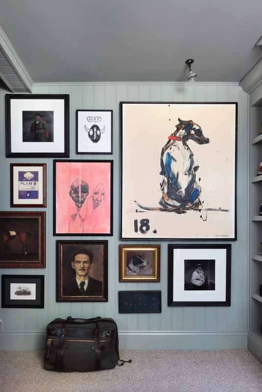
• Cohesion = calm. A consistent palette creates flow and ease from room to room. Your home feels connected. Intentional. Peaceful.
• You’ll buy less. No more purchases that don’t “go” or getting stuck with stuff that looked fab in the shop but clashes in your living room.
• Styling becomes EASY. Accessories, furniture, art… it all works together, so you can move pieces around your home without starting from scratch.
• Design confidence skyrockets. No more second guessing. You’ve got a plan. You’re the boss.
It also makes repainting, refreshing, or switching up your space so much less stressful. No more reinventing the wheel every single time.
Your Colour BFF….
Here’s a fun trick… Open your wardrobe and take a good, honest look at what’s actually in there. Chances are, there’s one colour that pops up again and again.
The same jumper in three shades? That top you own in four colours but always reach for the navy? That’s not a coincidence… it’s a clue.
We’re naturally drawn to colours that make us feel good. They calm us. Energise us. Feel like us.
And spoiler alert: if it shows up in your wardrobe, it deserves a place in your home too.
Colours evoke emotion. It’s science-y, but also just makes sense.
- Red = energising and bold (great for creativity, not ideal for bedtime…)
- Blue = calming, cool and collected (like a spa in colour form)
- Green = grounding, refreshing, a nature hug for your eyeballs
- Neutrals = calm and controlled (but pair them well or they get boring, fast)
✨ How do I want my home to feel?
So before we dive into the colour wheel, pause and ask yourself:
Do you want to feel cosy and cocooned? Light and airy? Bold and vibrant?
Your home = your happy place. Not someone else’s Pinterest board. So let’s make sure it actually feels like yours.
Your favourite colour? That’s a brilliant place to start. Let it lead the way.

But… how do you actually create a whole home colour palette?
I’m so glad you asked.
Let’s break it down. But first, a little colour theory 101 (a little, don’t panic) If you want a colour deep dive, check out understanding colour when decorating.
Understanding the four colour schemes
This is where we bring out the colour wheel. If you don’t have one yet, you can grab this one on Amazon (yep, it’s the one I use too!).
Here are your basic options when it comes to a cohesive palette:
1. Monochromatic
One colour, lots of tones. Think calm, minimal, modern. Great for neutrals or lovers of “quiet luxury.”
2. Complementary
Bold and high contrast. These colours sit opposite each other on the colour wheel, like navy + rust or sage + soft pink. If you like drama and personality, this is your friend.
3. Split-Complementary
This one’s a softer version of complementary. You pick your main colour, then use the two colours next to its opposite. Balanced but still interesting.
4. Analogous (aka harmonious)
Colours that sit next to each other on the colour wheel…like green, teal, and blue. They naturally blend well together and give a calm, curated feel.
Warm Or Cool – Yes it matters!
Every colour has either warm or cool undertones. And trust me, this makes a huge difference when you’re trying to create flow.
Warm colours = red, orange, yellow tones
Cool colours = blues, greens, purples
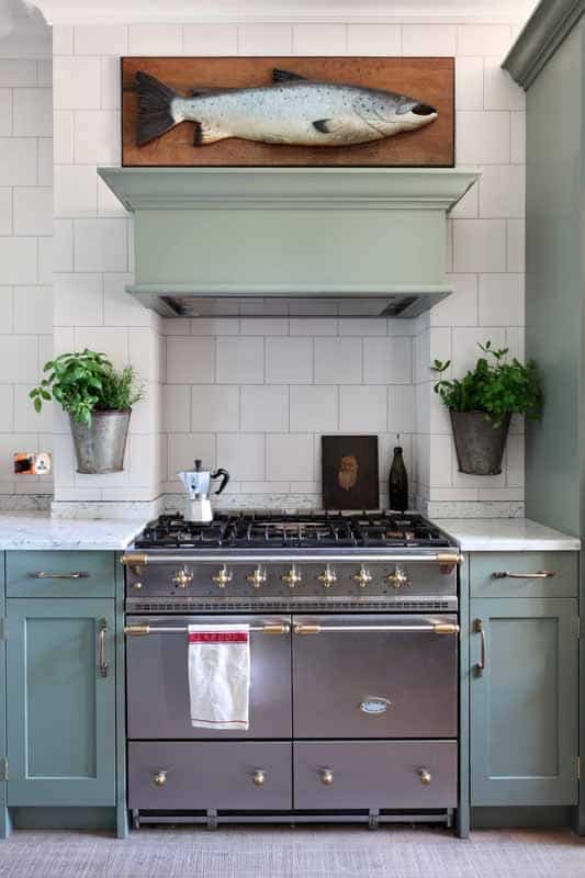
You might already have finishes (floors, kitchens, metals) with a warm or cool vibe. For example:
• Oak floor? That’s warm.
• Chrome tapware? That’s cool.
• Brass or gold hardware? Warm again.
So when you’re choosing whites, neutrals or bold colours, make sure they match the vibe of what’s already in your home. Otherwise things can feel a bit… off.

5 Steps To Creating A Whole Home Colour Palette That’s Right For YOU

Choose A White
White is white, right? Wrong!
White isn’t just white. Every one has an undertone (warm or cool). You’ll use this white on your skirting, doors, ceilings and trim (If that’s your vibe and you’re not colour drenching it to within an inch of its life!).
💡 Top tip:
• If you have warm finishes (oak floors, brass), choose a warm white
• If you’ve got cooler finishes (grey floors, chrome), go for a cool white

Choose A Neutral
Your neutral is the glue.
This is what you’ll use in hallways, connecting spaces, or open-plan areas. It could be:
• Beige
• Grey
• Greige (yep, it’s a thing)
• Taupe
• Soft cream
Or even a super-muted version of your favourite colour.

Choose A Main Colour
This is your anchor. It sets the tone for your whole home. You’ll use it in accessories, art, soft furnishings, and maybe a feature wall or two. Doesn’t need to be bold… it just needs to be you.
Ask yourself:
👉 What colour makes me feel good?
👉 What colour shows up in my wardrobe all the time?
That’s your clue.

Choose A Second Colour
Depending on your scheme:
• Monochromatic – choose a lighter/darker version of your main colour
• Complementary – choose the colour opposite on the wheel
• Split-Complementary – one of the colours next to your main colour’s opposite
• Analogous – pick the colour right beside your main one
This adds depth and versatility. You can use this second colour in art, cushions, lamps, even a painted piece of furniture.

Choose A Third Colour
Step 5: Choose your third colour (if needed)
You don’t have to go wild here. Keep it simple and refer to your scheme:
• Monochromatic – another tone of your main colour
• Complementary – skip the third colour (it’s bold enough)
• Split-Complementary – pick the other colour next to your main colour’s opposite
• Analogous – choose the other colour beside your main one that you didn’t pick in step 4
This third colour usually shows up in smaller ways… think vases, napkins, or artwork accents.

What the heck is the 60/30/10 rule?
Once you’ve landed on your colours, there’s one more magic ratio I want you to know about. It’s called the 60/30/10 rule, and it’s basically the secret sauce behind every room that just feels right.
Here’s how it works:
• 60% – This is your main colour. The base of the room. The colour that wraps itself around the space and sets the mood. Usually your walls, big pieces of furniture, and maybe a rug.
• 30% – This is your secondary colour. Think of it as your wingwoman. It brings balance, contrast, and depth. You might use it on things like curtains, accent chairs, or side tables.
• 10% – This is where the fun happens. Your accent colour. The jewellery of the room. A pop in a cushion, a picture frame, a vase that makes you happy every time you walk past it.
When you follow this simple ratio, you create natural visual harmony… without having to second-guess every single choice. It’s one of those “interior designer rules” that works whether you love bold colour or calming neutrals.
Oh, and here’s the good bit: once you’ve got your whole home palette, you can rotate your 60/30/10 in every room. Use one of your accent colours as the lead in one space, then dial it back in another. That’s how designers create homes that flow… but still feel interesting and layered. Cohesion without carbon copy vibes.
Real talk…
In 2006, before I trained as a designer, I did exactly what most homeowners do… winged it. £20k later, I had a mismatched house, tester pot regret, and a deep desire to go back in time.
But here’s what I know now: there’s a formula to getting this right. A sexy mix of science, psychology, and your personal style. When you understand it? You’ll never decorate the same way again.
And if you want to check out all the things I have to help you nail your home design, have a mooch over here.
Struggling to choose colours that actually go together?
You’re not alone, my love. Choosing one paint colour is hard enough… but picking a whole palette for your entire home? That’s a next-level kind of overwhelm.
I’ve renovated 4 homes (the 5th is in progress and my biggest one yet), worked on millions of pounds worth of renovation projects, and helped thousands of homeowners get that polished, pulled-together look…without a design degree or needing to be fluent in Farrow & Ball.
A beautiful home doesn’t start with Pinterest. It starts with a plan.
Which is exactly why I made you this:
✨ The Colour Palette Collection… 20 designer-approved colour combos to help you ditch decision fatigue and actually get started.
With actual paint colours you can actually buy… because no one’s got time for a hex code that only exists in the land of graphic designers and unicorns 🦄🎨.
These palettes are grounded in the real world (hello Farrow & Ball, Little Greene, and all the shades you’ve squinted at in B&Q).
It’s your shortcut to clarity… a curated collection of colour schemes to spark ideas, inspire cohesion, and give you the confidence to pick a palette that actually works.
🎁 Grab my free Colour Palette Collection
Just plug, play, and paint like a pro.
Big love,
Natalie x