
Paint Colour Trends For 2020 – The Key Colours To Paint Your Home In This Year
The start of the new year. A time when we’re craving a fresh start, new beginnings and errrrm… Pay day! January = the month with 365 days.
Following on from our easy ways to declutter your home post last week, we know that this is the time of year when we all want to make design changes in our homes. But, when budget is a little stretched an easy solution is to turn to the ‘power of paint’.
With a little new year spirit, a bit of determination and a tin of emulsion, you can easily and instantly update a room in your home. And often for less than 50 quid. Hello a few more mojito’s to make those dark winter days a little more bearable.
With all this in mind, what’s hot in the world of paint colours? We’re rounding up all the paint colour trends for 2020 to give your house a fresh new on trend look.
If you’re looking for some creative painting ideas, make sure you check out our ultimate guide to painting your living room.
So, it wouldn’t be right if we didn’t start this without taking a look at Dulux’s paint colour of the year for 2020 – Tranquil Dawn.
Tranquil Dawn – Dulux

Image Credit: Dulux
Okay, so there it is, look taken. I’ll be completely honest and say the 2020 Dulux colour of the year has me feeling a little sleepy. So sleepy in fact that I’ll be snoozing all the way until Christmas.
Actually this is Dulux’s intention. The grey based, washed green hue was born from a desire for us all to reconnect with nature and feel a little calmer in this technology driven world.
This may well be true from a psychological perspective, it certainly evokes a sense of calm. But for me, it’s a little too void of any real character. That said, it’s certainly very liveable, and I’m not sure it will be offending anyone.
I am not completely convinced this will be a great colour for Dulux profits in 2020 (sorry Dulux). But green is definitely going to have a big year, so onto some greens that are a little less wishy-washy for 2020.
Aquamarine – Little Greene


Image Credit: Little Greene Paint
Green hues are very en vogue at the moment, and there are plenty to choose from depending on the look and vibe you want to achieve. If it’s calm and serenity that you’re after then take a look at Little Greene’s Green Colour Collection. One of my favourites is Aquamarine 138. A Classic blend of blue green using umber to create a subtlety which brings a gentle coolness and tranquility to a room.
Duck Green – Farrow & Ball


Image Credit: Farrow & Ball
If you’re looking for a dark green hue that has a modern look but retains a heritage feel then Colour by Nature collection by Farrow & Ball may have the answers. Duck Green is from F&B’s new collaboration with the Natural History Museum and was released at the end of 2019.
Named after the deep green plumage of a Mallard, Duck Green is a wonderful reminder of the exquisite colours of nature. A strong green hue but retaining the subdued feel that Farrow & Ball are famous for.
As in the kitchen image above, it looks lovely combined with the dusty pink of Pink Ground. A pink with a big dollop of yellow creating a soft blush of colour that’s warm and soothing but doesn’t feel too sweet.
But, If green isn’t really your thing in 2020, let’s take a look at some of the other paint colour trends for 2020.
Mylands Paints S/S Blue Collection

Image Credit: Mylands
Blue is a colour associated with coolness and calm (great for our year of reconnection). It’s been a popular hue for a few years and it’s not going anywhere in 2020. Myland’s new spring 2020 colours include Walpole, Morning Blue, Observatory, and FTT 018 from the Film, Television and Theatre paint collection.
A collection of hues ranging from the understated calm of Walpole Blue, right through to the high energy and impact of the electric FTT 018.
My personal favourite is the Observatory 38 (bottom left). It’s a deeply intense indigo blue inspired by the night sky, calming but richly sophisticated. Personally I don’t see quite where electric FTT018 sits within this supposedly “layerable” curated collection. It’s a little too jarring for me. I am a lover of the elegant and sophisticated, not bold colour pops. Perhaps a splash of energy to get our attention? With the exception of FTT018 I feel this is an easy to layer collection for a harmonious and sophisticated feel in your home.
Calamine & Sulking Room – Farrow & Ball
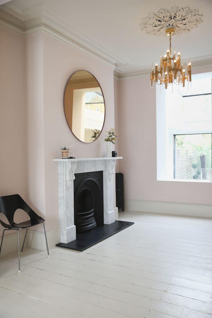

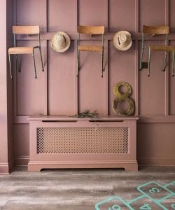
Image Credit: Farrow & Ball
Image Credit: Farrow & Ball
Two colours I’ve fallen in love with this year are a couple of pinks by Farrow & Ball. And I feel they’ll be strong contenders for trend setting in 2020.
Calamine (left) is a delicate pink with grey undertones, the grey gives this a coolness and stops it from becoming too sweet. In small spaces it can be quite intense, in larger well lit spaces it’s much more delicate.
Sulking Room Pink (right) – I adore the name of this paint, who doesn’t want a sulking room? And a sulking room that’s so muted and delicate? A gorgeous muted rose pink with bags of warmth. I also think it looks absolutely amazing paired with a contrasting black such as Paean Black, allowing the duskiness to shine!
If you’re more a of neutral girl, but are a little bored of grey, check out this blog 5 neutrals to make you forget about grey.
What’s your go to favourite paint colour this year? Let us know here!
And if you’re looking for a little more guidance when it comes to creating your dream home, why not join HomeEnvy Bootcamp – a one-stop shop for all things interior design, including masterclasses on creating your dream space, 20% trade discounts, access to professional interior designers, weekly design packs, and a private community of like-minded individuals.