

Is Farrow and Ball paint worth the money? It’s the question I get asked more than any other, and it usually arrives with a bit of an eye-roll attached. Before I jump in, I’m not singling Farrow and Ball out here, this is about all the designer and premium paint brands.
What’s so special about Farrow and Ball? Do decorators actually like it? Is there even a difference? Let me try and answer all of it.

Paint is a surprisingly complex subject. Not that I expect you’re in the market for space shuttle exhaust paint that withstands ultra-high heat (that’s Jotun, who also make an elastic paint that physically stretches in your hands), or for the bomb-proof adhesion of Keim mineral paints, which chemically bond to the surface. But it’s fair to say not all paints are created equal.

When I first started as a designer in 2010, I was a Dulux devotee. Hundreds of premixed colours in thousands of tints, tones and shades, and a wall of paint chips I could spend hours investigating under those little lamps. Why would you pay double for fewer choices? I didn’t understand the difference.
And the trade couldn’t agree either. Some decorators loved Farrow and Ball and Little Greene, some despised them (and honestly, I take cover when ever I do a ‘designer paint’ post over on Instagram, it brings up a lot of snobbery). It took me a while to work out who was right.
The honest answer: everyone comes to this debate valuing different things. Coverage and the fewest coats. Cost on the whole project. Colour choice. Ease of application. Durability. Colour complexity. Eco credentials. There’s no right or wrong, so I’m not here to tell you to always buy high-end paint or never to.
I’m here to show you what’s actually different, so you can decide based on what matters to you.
By designer paints I mean brands like Farrow & Ball, Little Greene, Paint & Paper Library, Coat, Mylands, and for American readers, Fine Paints of Europe and Benjamin Moore (And if you want to see every brand that’s earned a place in my projects, they’re all in my free interior design supplier directory).
1. The Pigment
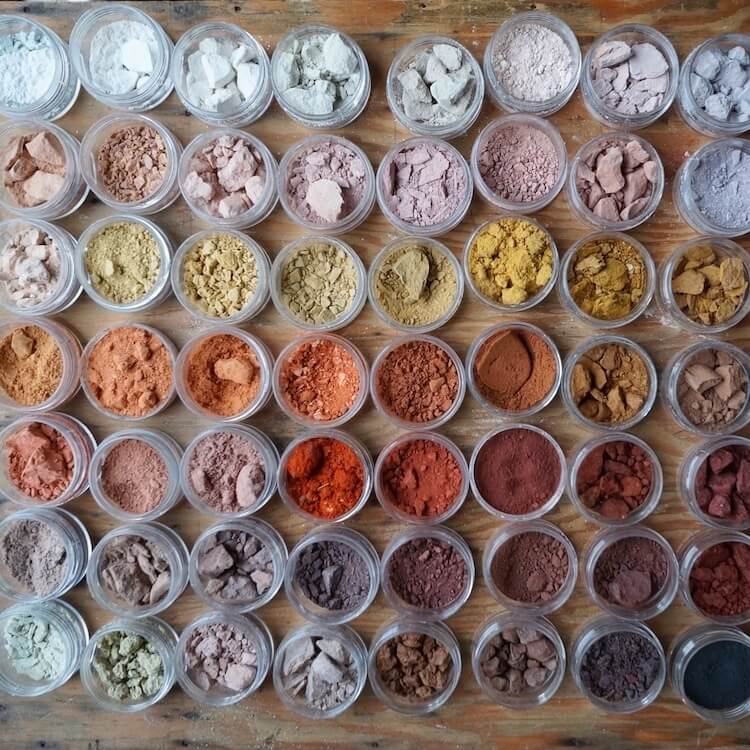
The first and most obvious difference is pigmentation. Little Greene paints contain 40% more pigment than ordinary paints. On your walls that means colour complexity: greater depth, even in light neutrals, and colours that shift beautifully as the light changes through the day.
2. The coverage maths (the bit everyone misses)
The price on the tin and the price on your wall are different numbers, because the tins don’t cover the same amount of wall.
- Valspar Premium (budget): £44 for 5 litres, covers 10 m² a litre. 88p per square metre, per coat.
- Farrow & Ball Modern Emulsion: £111 for 5 litres, covers 12 m² a litre. £1.85 per square metre.
- Little Greene Absolute Matt: £104 for 5 litres, covers 14 m² a litre. £1.49 per square metre.
Read per coat, the budget tin still wins, and I’m not going to pretend otherwise. But two things change the sum.
The first is coats. High pigment covers, that’s the whole point of it.
I’ve stood in front of two coats of a cheaper paint and watched it sit patchy on the wall (a Dulux, in my last home, and the third coat was not painted happily). It doesn’t happen every time, it depends what you’re covering, but it happens.
And the moment that third coat goes on, the £44 budget tin costs £2.64 per finished metre against Little Greene’s £2.97 at two coats. Thirty three pence apart. A £44 tin and a £104 tin, within pennies of each other on the finished wall, and one of them gives you the depth, the finish and the colour that started this whole conversation.
Then add the labour: you (or your decorator) spreading around 7 litres of paint to achieve what 5 litres would have done. More time, more money. And if you’re into a third coat, maybe even an extra day.
The second is tin size. Farrow and Ball’s 750ml works out at £45 a litre. The same paint in the 5L is £26 a litre. Nearly double, for the same paint in a smaller tin. Once the colour’s decided and the room is yours, buy the big tin, whatever brand you land on.
(You might also have noticed Little Greene sneaking past Farrow and Ball in that list, more coverage per litre and a cheaper tin. Hold that thought, because it’s exactly where we’re going in a minute.)
3. The Materials
Stay with me, this is the scientific bit. Designer paints use high-grade titanium dioxide, a pure white powdered pigment that covers brilliantly. Cheaper paints substitute fillers like synthetic silicates, polymers, clay, talc and carbonate, which cover so poorly that depending on the brand you might need up to 8 times more paint for comparable opacity.
Those fillers are the third coat I was talking about earlier.
4. Farrow and Ball vs Little Greene: which would I pick?
The comparison everyone actually googles, so let me answer it straight.
They’re both proper designer paints, both heavily pigmented, both a world away from the budget brands, and you won’t ruin a room with either.
The differences are at the edges: Little Greene’s colour collection is far bigger (around 2,000 premixed colours, walk into a stockist, mine is William Robinson Interiors in Nottingham, my favourite showroom, and you can see the lot), while F&B’s strength is that very curation, a smaller palette where the colours are famous for a reason and endlessly photographed in real homes, which makes them easier to research before you buy.
If you’re asking which one ends up in my own projects most, it’s Little Greene, and honestly it comes down to the finishes.
I adore Farrow and Ball’s muted palette, I always will, but the formulation has definitely changed over the years, and the Estate Emulsion in particular isn’t durable: it can’t be easily cleaned and it does mark.
Little Greene’s Intelligent finishes are washable and properly hard-wearing, and once you’ve lived with them it’s hard to go back. F&B do now make a more durable finish of their own, but I’ll be honest, the Intelligent range won me over before I ever really explored it.
And here I’ll add a third name to the mix, Paint & Paper Library, my favourite of the lot.
One fact settles any quality questions, Little Greene make it.
David Oliver founded the brand and had Little Greene manufacturing his paint for twenty years, before officially handing the whole company over in 2015. Same factory, same standards, made using similar high quality, richly pigmented bases.
Which means the choice is really a choice of palette, and Paint & Paper Library’s is the more muted, grown up card, closer to Farrow and Ball’s mood than Little Greene’s cheerier colours. Then there’s the bit I really love, the numbered scales: colours come in graduated strengths of the same shade, I to V, so the ceiling, walls and woodwork pick themselves off one strip, lightest up top, deepest on the timber, different ones in different rooms for the same whole house feel. A whole set of decisions, made in one go.
But if your heart is set on a Farrow and Ball colour, buy the Farrow and Ball. Which brings me to colour matching.

Can’t I just colour match it cheaper?
Let’s pretend you haven’t read this far, cost is your driving factor, and you simply must have Cornforth White in your living room, so you decide to colour match it at Valspar or Johnstone’s. It’ll look identical, right?
No. No it won’t.
I’ve tested this on several colours, light through to dark, and a colour match is never accurate. The bases are different, different materials, different resins, and most brands mix their own pigments. Even the spectrophotometer (the gadget doing the measuring) is only about 90% accurate, and sample condition, light and sheen all throw it further.
I can’t imagine you’d ever think of using a colour match to patch up a scuffed and damaged genuine Farrow & Ball painted wall. It will likely be similar, and if similar is what you’re going for then that’s great, but it will not be the same.
Most people fall into the trap of assuming light colours are the safe ones to match. In my experience the lighter colours give you MORE headaches, because the lighter bases at the budget brands lean yellow and throw the pale hues off.
A colour match is a custom product, mixed for you, and returns aren’t often possible. If a specific F&B or Little Greene colour is the one you want, buy the real one, or choose a colour from the brand you’re actually buying so you know what you’re going to get in the tin before you open it.
If colour matching is your preferred option, and you want to be sure what you’re going to get, buy the smallest size you can and test first, on card, move it around to different locations, and look at it at different times of the day.
So, is Farrow and Ball paint worth the money?
Take the pigment, the coverage maths, the time and labour, the materials, the colour-matching truth together and my answer is yes. Yes, it is.
Sometimes the bank balance is the biggest consideration and that’s completely fine, there are rooms in my past renovations that prove it. But if you want depth of colour and a durable, cleanable finish that still looks right in five years, the premium brands are the accurate choice and not the indulgent one.
And if you’re about to buy from any of the brands mentioned, Home Design Vault members save 10% on Farrow and Ball and 15% at Little Greene and Paint & Paper Library. Also Mylands, Edward Bulmer, Coat, Bauwerk, Eartborn and at hundreds of other sought-after brands through my trade accounts.
Members also get the design library of 360+ done-for-you room schemes and a design team to ask before committing to a colour. Have a look at the Home Design Vault, the paint savings alone tend to cover it.
Natalie x
